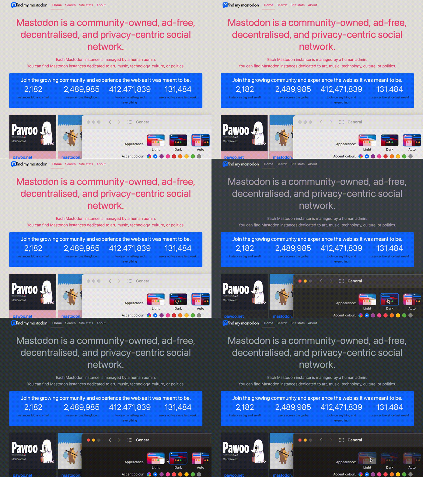
You’re likely already familiar with media queries. They’re in widespread use for making websites responsive. The width and height properties contain the viewport’s dimensions. We then use CSS to render different layouts at different dimensions.
The prefers-color-scheme media query works the same way. The user can configure their operating system to use a light or dark theme. prefers-color-scheme contains that value. The value is either light or dark, though the W3C spec states that it might support future values like sepia. We specify different values of CSS variables for both modes and let the user’s OS decide.
The prefers-color-scheme media queries
The two variations of the prefers-color-scheme media query are:
/* Light mode */
@media (prefers-color-scheme: light) {
    :root {
        --body-bg: #FFFFFF;
        --body-color: #000000;
    }
}

/* Dark mode */
@media (prefers-color-scheme: dark) {
    :root {
        --body-bg: #000000;
        --body-color: #FFFFFF;
    }
}
In the above CSS, --body-bg and --body-color are CSS variables. As you can see, they contain different values for both modes. In the light theme, we’re setting a white background with black text. In dark theme, we’re setting black background with white text.
Since the spec says that W3C might introduce future values, it makes sense to convert our CSS into a boolean.
/* Light mode */
:root {
    --body-bg: #FFFFFF;
    --body-color: #000000;
}

/* Dark mode */
@media (prefers-color-scheme: dark) {
    :root {
        --body-bg: #000000;
        --body-color: #FFFFFF;
    }
}
In the above code, we’re defining a light theme by default, and converting to the dark theme if the media query is dark. This way any future values added to the media query will set the light theme by default.
Using the CSS variables
Now that we have different values for different themes, we need to actually use it to style our page.
body {
    background: var(--body-bg);
    color: var(--body-color);
}
The var() syntax is how CSS uses variables. In the above code, we’re saying that background should be set to the value of --body-bg. And color should be set to the value of --body-color. Note that the values of these variables are coming from our media query. Meaning that our background and foreground colour changes based on the OS’s setting! This is the real power of the media query: providing a consistent user experience from OS to the web page.
If you go to findmymastodon.com and switch you OS’s theme you’ll see the transition from one theme to another. The video below shows the smooth transition from light mode to dark mode on Mac OS X.
The CSS WG website also uses the same media queries. Change your OS theme and the website will switch themes to adjust.
Conclusion
Notice that using prefers-color-scheme is no different from using a regular programming language. We define variables whose values change based on some logic. And those variables are then used for further operations.
The ability to let your website adjust to the user’s theme of choice is a great accessibility feature. And it further blurs the line between desktop and web for the benefit of the user. Latest browser versions support prefers-color-scheme so you can begin experimenting today.
Happy coding :)
