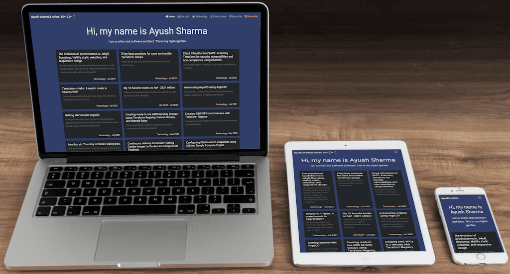
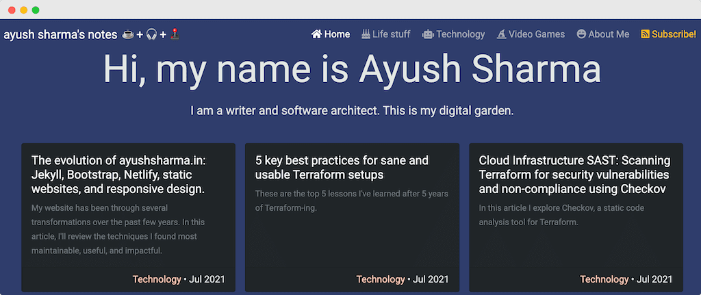
The evolution of ayushsharma.in: Jekyll, Bootstrap, Netlify, static websites, and responsive design.

My website has been through several transformations over the past few years. In this article, I’ll review the techniques I found most maintainable, useful, and impactful.
1. Using Jekyll Collections for navigation elements
Collections is powerful feature in Jekyll which is used to define lists of items. On this website, I use them to maintain the main navigation elements and social media handles. Since they are basically YAML files, Collections are very flexible and can be used for a variety of use-cases.

I’ll highlight it with an example. This website’s header navigation collection uses this format:
---
href: "/"
href_class: ""
title: "Home"
icon_class: "fas fa-home"
sort_order: 1
---
hrefis the relative page link.href_classis the CSS class to be applied to theanchortag.titleis the link’s display text and title.icon_classis the FontAwesome icon class for the link.sort_orderis used to order the links in ascending order.
Once the collection is defined, Liquid’s for loop can be used to iterate over it:
{% assign sorted_nav = site.collection_nav_links | sort: 'sort_order' %}
{% for nav in sorted_nav %}

{% assign is_active = "" %}
{% assign is_active_aria = "" %}
{% assign page_cat = page.Category | slugify | prepend: "/" %}

{% if page.permalink == nav.href %}
	{% assign is_active = "active" %}
	{% assign is_active_aria = "aria-current=\"page\"" %}
{% elsif is_active == "" and page_cat == nav.href %}
	{% assign is_active = "active" %}
	{% assign is_active_aria = "aria-current=\"page\"" %}
{% endif %}

<a class="nav-link {{ nav.href_class }} {{ is_active }}" href="{{ nav.href }}" title="{{ nav.title }}" {{ is_active_aria }}><i class="{{ nav.icon_class }} mx-1"></i>{{ nav.title }}</a>

{% endfor %}
- The first and second lines begin the iteration over
site.collection_nav_linkscollection in ascending order ofsort_order. - The
assignstatements that follow are used to save the currently selected page or post category, which is then used to highlight that page in the navigation. - The
anchortag picks the links, titles, and values from the collection object and uses them to assemble the link.
I use the same process to render social media handles as well. This is the Collection item for my GitLab profile:
---
title: "GitLab"
href: "https://gitlab.com/ayush-sharma"
icon: "social-gitlab.svg"
sort_order: 3
---
The code for iterating over the social media Collection is:
{% assign sorted_links = site.collection_social | sort: 'sort_order' %}
{% for nav in sorted_links %}

	<div class="d-grid col-12 col-md-3 gap-2">
		<a class="btn btn-success" href="{{ nav.href }}" title="{{ nav.title }}" target="_blank"><img src="{{ site.content-images-path | prepend: site.baseurl | prepend: site.url }}{{ nav.icon }}" width="25" height="25" alt="Ayush Sharma on {{ nav.title }}"> {{ nav.title }}</a>
	</div>

{% endfor %}
2. Responsiveness: visibility classes, size md sx classes, using cards
Maintaining this website is not my full-time job. So the tech stack required to build the site had to fulfill certain criteria: a) it had to be low maintenance, b) it had to be usable even with my limited HTML, CSS, and JavaScript skills, and c) it had to be responsive.
Bootstrap was one of the first front-end frameworks I used and thankfully it fits my criteria even today. It’s easy to set up and integrate and features a minimalist, user-friendly interface design. Bootstraps’ simple Card-based layout scheme helped me achieve symmetry between long-form content of various lengths at different screen sizes.
Bootstrap also has helper classes for displaying or hiding content on smaller screens. This allows me to customize not just the layout but also the content for different screens. If you’re viewing this page on desktop, the website’s heading will be “ayush sharma’s notes”; on mobile devices it will be “ayush’s notes”.

This is achieved by using d-sm-none and d-sm-inline classes.
<a class="navbar-brand" href="/" title="Ayush Sharma's personal notes">
	ayush<span class="d-sm-none">'s</span>
  <span class="d-none d-sm-inline"> sharma's</span>
   notes
  <span class="d-none d-sm-inline mx-1">
	  <span class="mx-1" title="tea">☕</span>
	  +<span class="mx-1" title="music">🎧</span>
    +<span class="mx-1" title="video games">🕹️</span>
  </span>
</a>
3. Building category pages for filtering content
I recently introduced separate sections for Technology, Life Stuff, and Video Games. The process of creating three new pages was surprisingly easy: all it required was adding a new variable to Jekyll’s front-matter. This post’s source code in GitLab starts with the following metadata:
layout: post
title:  "The evolution of ayushsharma.in: Jekyll, Bootstrap, Netlify, static websites, and responsive design."
number: 108
date:   2021-07-15 00:00
excerpt: "In this article, I'll highlight some ideas for Jekyll collections, blog category pages, responsive web-design, and netlify.toml to make static website maintenance a breeze."
Category: Technology
Every post has one of three possible values for Category: Technology, Life Stuff, or Video Games. These values are then used to show all posts in that category.
For example, the source code for the main Technology page looks like this:
---
title: Technology
---
{% assign posts = site.posts | sort: 'date' | reverse %}
{% for post in posts %}

	{% if post.Category != page.title %}
		{% continue %}
	{% endif %}

		<!-- Display post content -->

{% endfor %}
The copde on line 7 ensures that the post’s content is displayed only if the post Category matches the page title (in this case Technology).
4. Excerpts
The flexiblity of Jekyll’s front-matter makes customisation simple. I introduced post excerpts a few months ago by adding a new variable to every posts’s front-matter. The excerpt gets displayed in the Card and header for every post.
---
layout: post
title:  "The evolution of ayushsharma.in: Jekyll, Bootstrap, Netlify, static websites, and responsive design."
number: 108
date:   2021-07-15 00:00
excerpt: "In this article, I'll highlight some ideas for Jekyll collections, blog category pages, responsive web-design, and netlify.toml to make static website maintenance a breeze."
Category: Technology
---
5. Enabling security headers with Netlify
I’ve used Netlify to deploy the site for over a year. Apart from simple integration with GitLab, one of my favourite features is the level of customisation possible within the netlify.toml file.
[headers.values]

Content-Security-Policy = "default-src 'self'; script-src 'self' https://www.google-analytics.com https://www.googletagmanager.com https://cdn.jsdelivr.net; style-src 'self' https://fonts.googleapis.com 'unsafe-inline'; img-src 'self' https://www.google-analytics.com www.google-analytics.com https://stats.g.doubleclick.net data:; child-src 'self';  font-src 'self' https://fonts.gstatic.com; media-src 'self'; connect-src https://www.google-analytics.com www.google-analytics.com https://stats.g.doubleclick.net"

X-XSS-Protection = "1; mode=block"

Strict-Transport-Security = "max-age=604800; includeSubdomains; "

X-Frame-Options = "DENY"

X-Content-Type-Options = "nosniff"

Referrer-Policy = "strict-origin"
I’ve written about why HTTP security headers for Content Security Policy, XSS Protection, HTTP Strict Transport Security, Frame Options, Content Type, and Referrer Policy are vital for web application security. And the ease with which these can be enabled with Netlify ensures that I don’t have to trade security for convenience.

&emoji=☕&slug=ayushsharma&button_colour=FFDD00&font_colour=000000&font_family=Cookie&outline_colour=000000&coffee_colour=ffffff)